Color Supply Premium
Hi there. I’m Mason, a visual designer from Los Angeles. I’ve worked in the design and advertising business for more than a decade. But even though I make a living as a designer, I used to struggle when it comes to choosing colors.
Here’s what would happen. I’d open up Photoshop or Sketch, and click around for a while skipping from color to color. There would be no rhyme or reason to it. If a certain color came to mind I’d just try it.
I would ask myself:
- Do these colors work for this brand?
- Are these three colors working in harmony?
- Why can’t I make color combinations that match?
I would often resort to using the same color combinations I always used (I’m looking at you orange & blue).
Eventually, I would come up with something but the process to get there was painful. And it chewed up a lot of time.
It should be so much easier
I did deep dives and researched color theory in books. And those books were helpful! But they covered colors in an abstract, academic way.
I wanted actual color samples that I could use in my projects.
Not to copy necessarily, but to at least get me started. I liked sites like Adobe Color, Paleton, and Colorizer, but they never quite worked when it came time to get s**t done.
The dream
For most of my career, I worked that way. But in the back of my mind, I always had an idea of what my ideal color picking tool would look like. I wanted a new and improved color picking process that saved a ton of time.
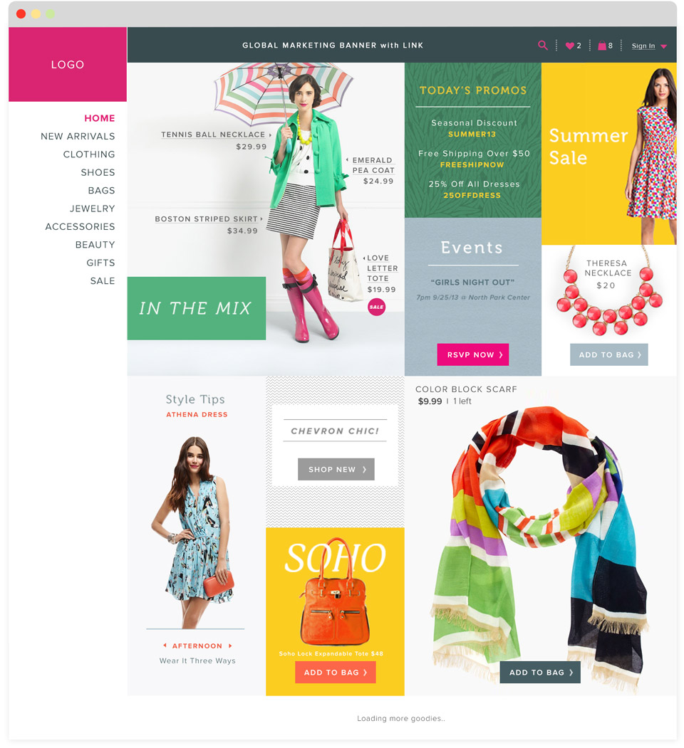
It looked like this. You sit down at your desk to start a new project. Your creative brief says you’re designing a fashion e-commerce site for young women. Fun!
You open this magic color tool and toggle through a handful of color styles all organized by theme. Some of the palettes are by the best contemporary designers living today, others are from 20th-century masters of color.
You explore the palettes on the ‘fresh’ wheel and consider different options...
The pink section jump out at you and you explore different variations until you decide on these colors:

This could work well for your project. And it fits the creative brief. Nice! You can either copy them exactly or use them as a base to build from.
Next you start designing. This is an entire process in and of itself but at least now you have some colors to work with! You work on a few layouts, add a color or two, and eventually, you have a design that your client loves:
Click for full size
And those colors only too a couple of minutes to find! Now you have more time for layout, fonts, and other considerations.
--
That’s what my ideal color picker looked like. Just one problem...
The tool I wanted didn't exist
So I set out to make it! Color Supply Premium is like the free version you've already used but with more options. Now I have these color palettes at my disposal:
If I need to design a trendy fashion e-commerce site I’ll use the Fresh wheel

'Fresh'
If I’m helping a friend with her Manga illustrations, I’ll use this wheel

'Manga'
If I needed some warm colors for a fall themed project, I’ll try this

'Nature'
If want to channel inspiration from impressionist painters, I’ll use the Painters wheel

'Painters'
It makes picking the right colors a breeze and I'm done in 5 minutes instead of an hour.
What you get:
-
'Fresh', 'Manga', 'Nature', & 'Painters' color wheels
-
Access to all future color wheels
-
Ability to bookmark your favorite colors for later
-
No risk, 30-day money back guarantee
What you’ll be able to achieve:
-
Find the perfect color combinations
-
Find colors that actually match
-
Break free of using the same color combinations
Most importantly it will give you the confidence to create amazing looking work and overcome the color roadblocks that were holding you back.